The letter “m” tested my sanity too
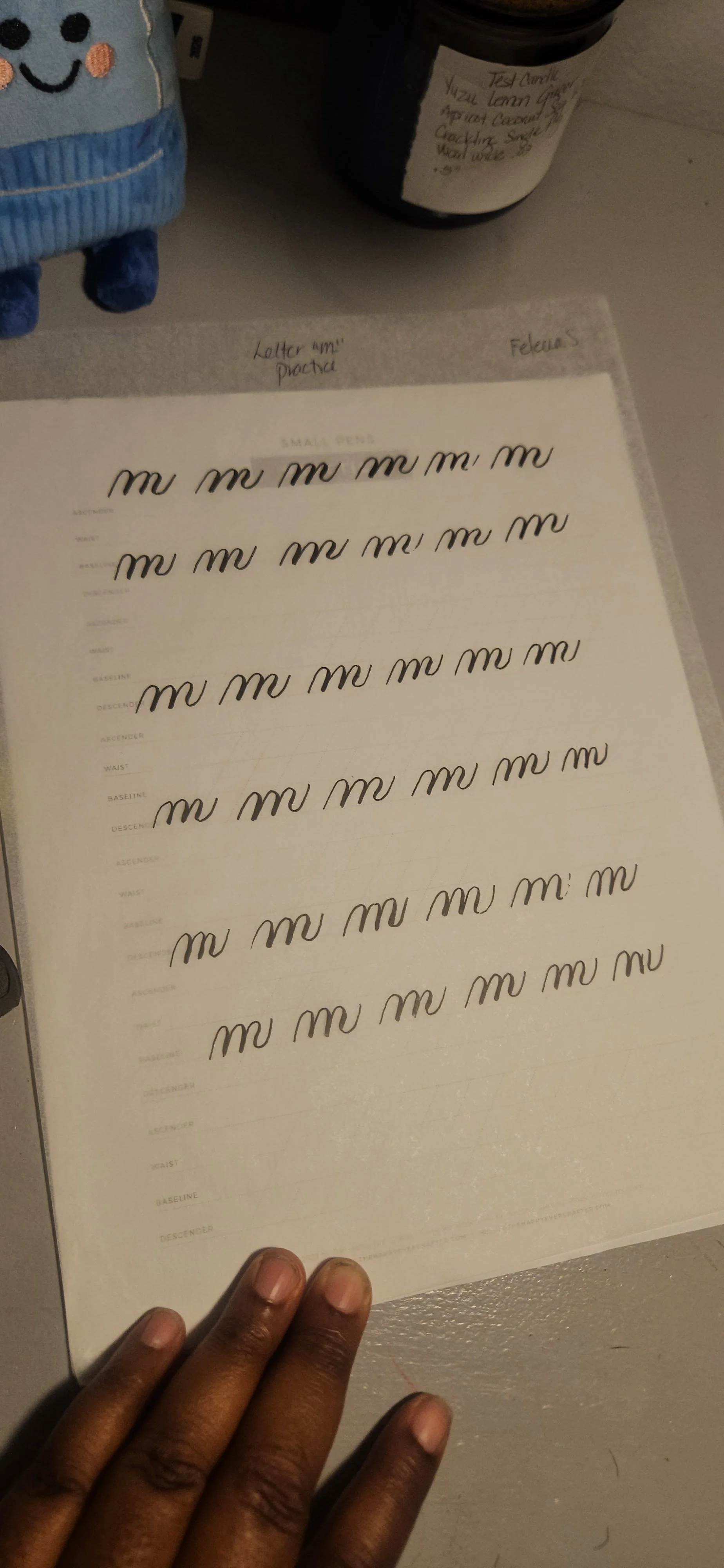
My letter “m”s were too close together and looked like baby spiders.
The letter "m" is tough. There's no other way to say it. What makes this letter tough is:
It takes two underturn strokes and one compound curve to create the letter ‘m’. Each stroke has to be the same height and width.
When writing this letter “m” people like to write the strokes too close together. The letter “m” looks bunched together.
I went through four sheets of paper to write the letter "m" properly. It was very tiring mentally and physically. In the practice video below, I go into detail about this. Beautiful lettering cannot be rushed into existence. It grows through dedication, repetition, and the willingness to keep learning.
Every practice session is another brick in the foundation you are building. Some days you add confidence, some days you add patience, and some days you simply learn what needs more work. Every brick matters.